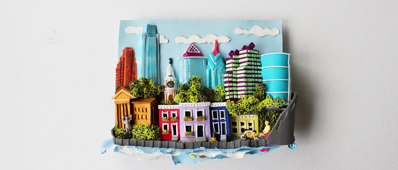
Philadelphia
This 3D colorful depiction of the beautiful city of Philadelphia has the following dimensions: 7.5 inches wide, 5.5 inches high and 1.5 inches deep .The piece is made of PVC clay and supported by an invisible stainless steal wire-frame that is extremely light.
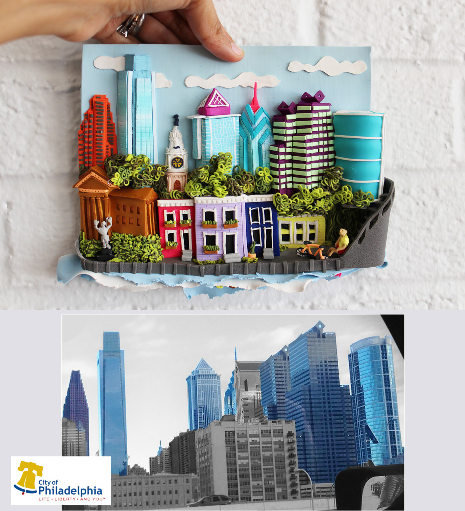
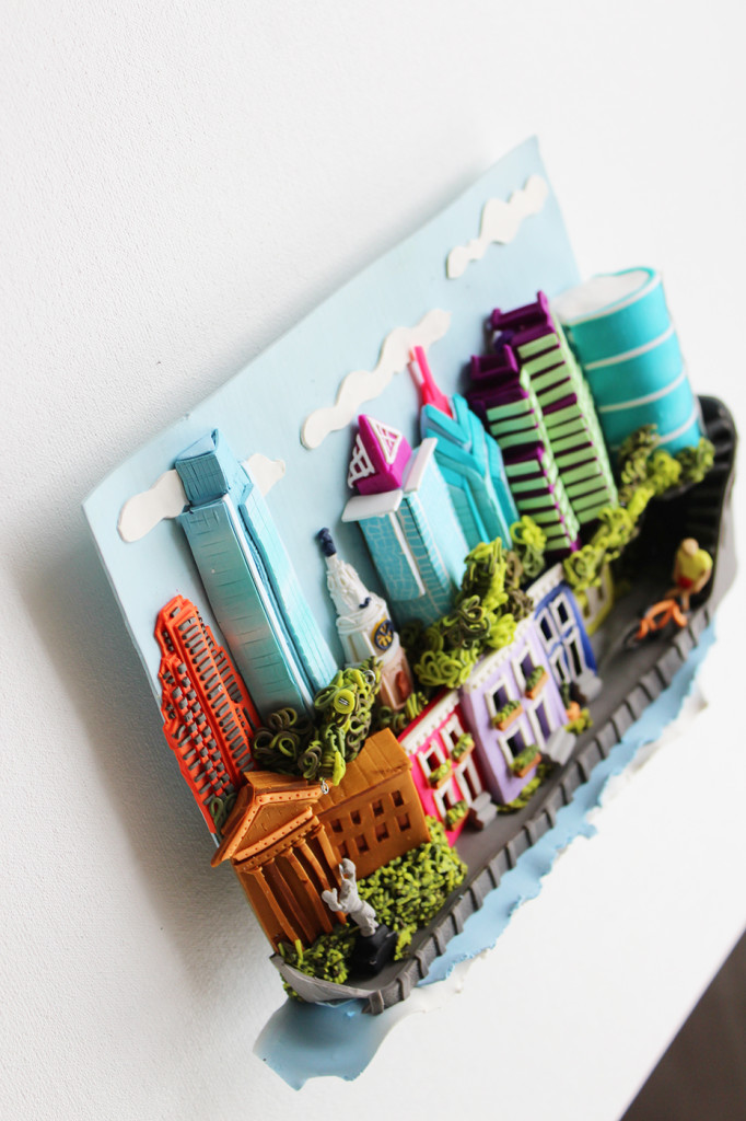
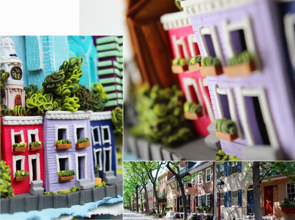
The 3D art piece is primarily inspired by a specific picture I took of the skyline of Philadelphia (which you can see below) that shows you the city from across the Schulkill river that borders the west side of center city. The buildings that were chosen to be part of this depiction are highlighted in a blue-ish color in the original inspiration picture. However the composition of this art piece, also contains elements of the city that you would not see from this, or any other angle of the city. Such as the many historic “town houses”, the Art Museum, the Rocky Statue (from the Rocky movies), the many trees that line up across its many historic streets, and the brand new boardwalk that has made the city even more beautiful than ever before.
Also, as a quick “fun” fact. Our home (which is a condo in a high-rise building called the Murano), can be seen at the very right-side of this piece. It’s the crazy “curved” building depicted in all light-blue.
A final interesting fact about this piece is how it was made.
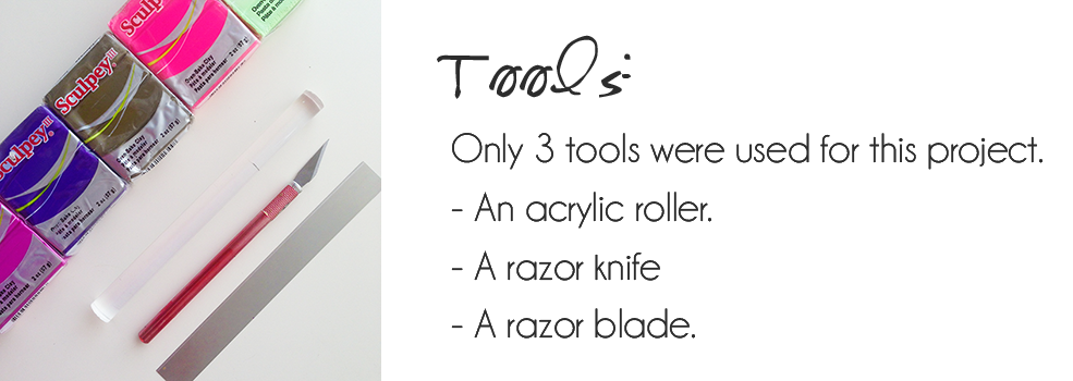
For those of you who are curious about the process, the only tools used to make this piece are detailed below.
The details are not meant to be “perfect”. Meaning perfectly straight, perfectly shaped, but instead balanced, fun and most importantly, playful.
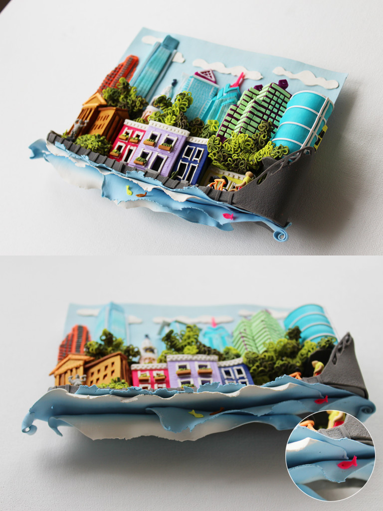
Top-left-side view:
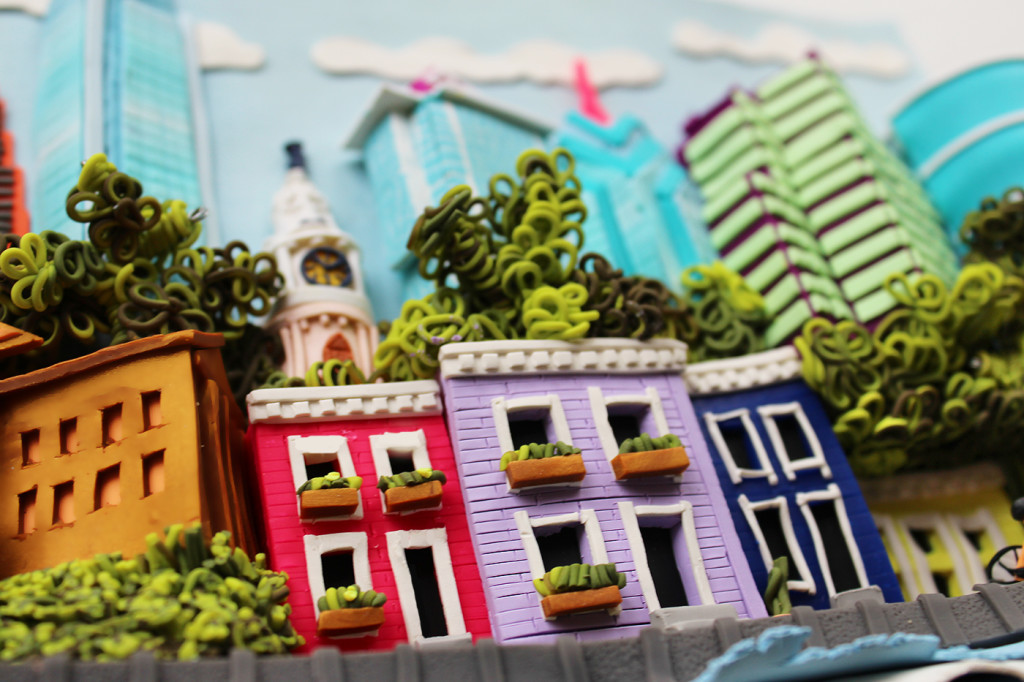
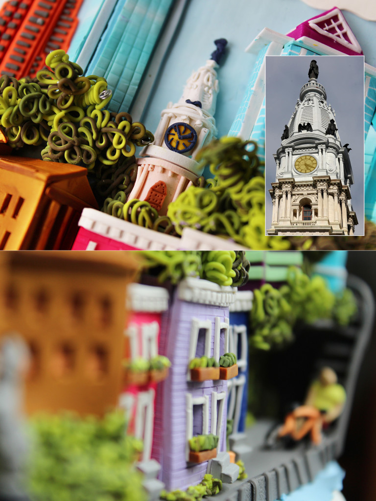
Town-Houses close-up:
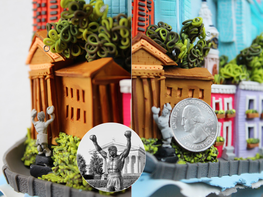
The Rocky Statue: The statue itself is smaller than an american “quarter” coin.
City Hall Tower and William Penn: If you’ve been to Philly, this is one of its most significant and visible landmarks. Below it, you’ll see also a side-view of the new boardwalk, which is heavily visited by joggers, walkers and bikers in the city.
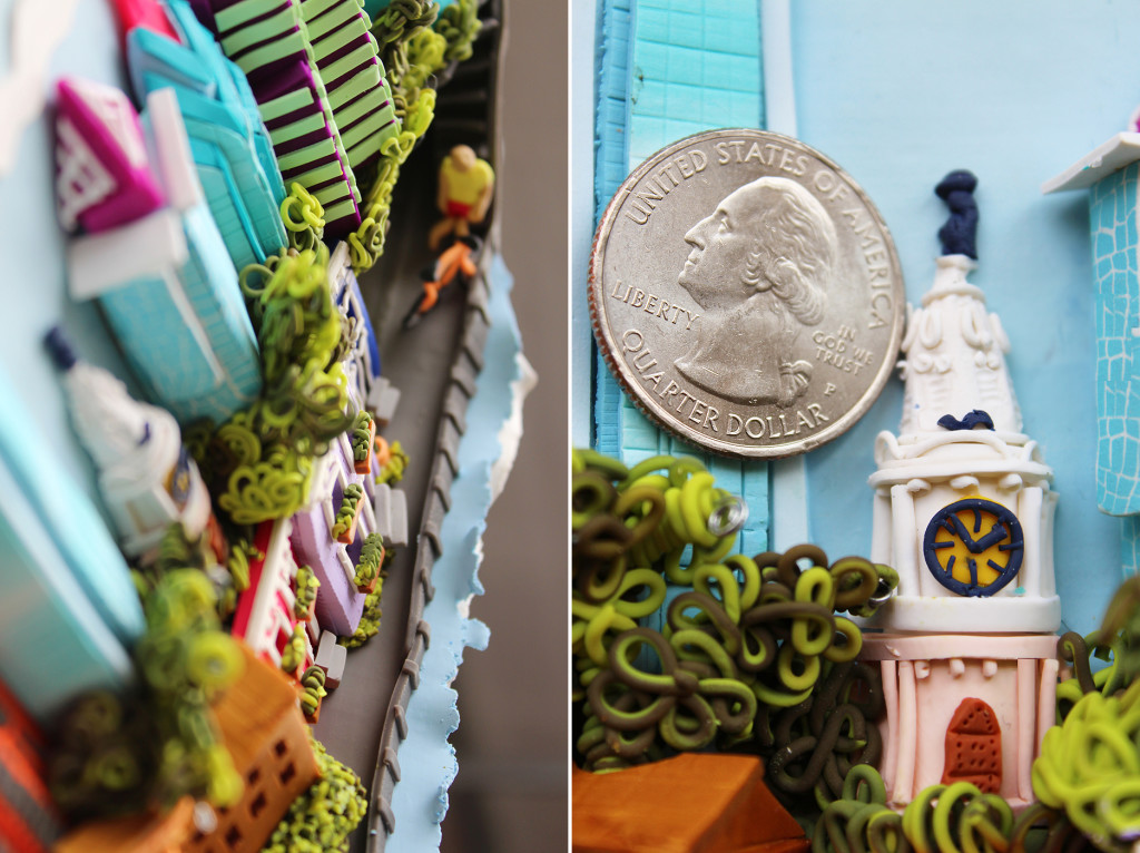
Another view of both elements, and depiction of its approximate size next to a quarter coin (the boardwalk on the water and City Hall/William Penn).
Now, if you’re so inclined and have any thoughts on this, I would be so very thankful:
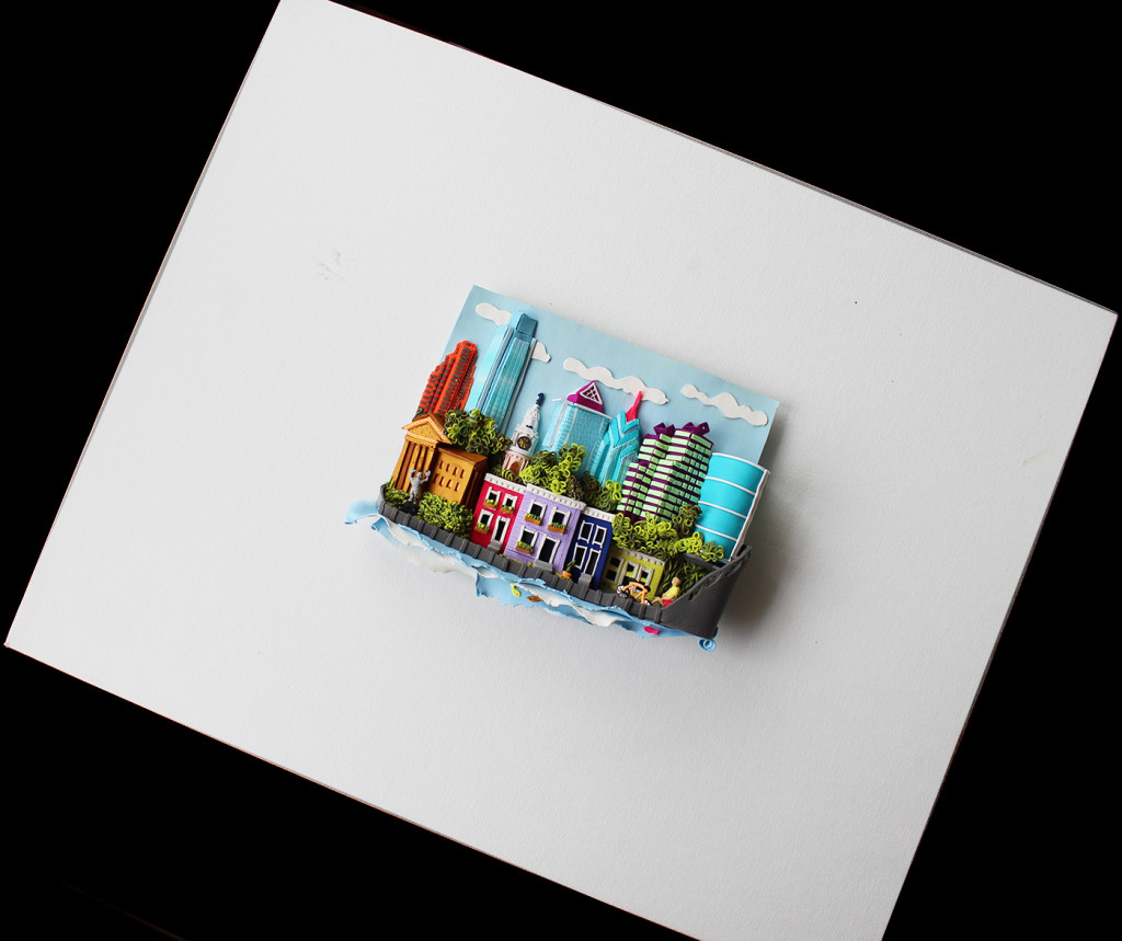
Since “framing” or “boxing” are two elements that can beautifully enhance an art-piece (if done right), I’m looking for ideas that might be a little more outside the box on how to go about it. So far, our fans have come up with 4 different kinds of “canvas” ideas that you can see below. The first and third canvas ideas are meant to convey a concrete/cement wall. The second (white canvas) and 4th (dark grey canvas) are simply meant to frame the piece.
The way I imagine this, there is a bit of a distance between the 3D art piece and the canvas, as to generate a bit of a shadow effect in between. Have a look to see what I mean:
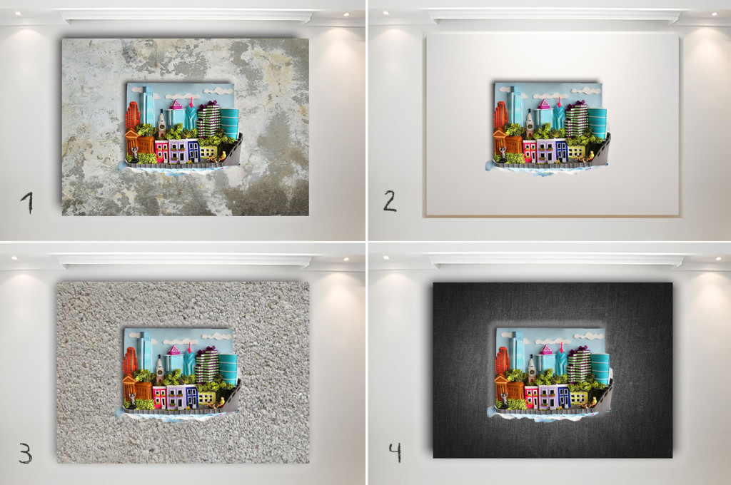
I believe this could also be installed in a “display box”/shadow box. I’m currently working on a custom “acrylic” design idea that I’ll run by you.
So here is where your help could be incredibly valuable:
- Do you like any of the 4 ideas above? If so, which is your favorite?
- Do you have any other (similar or different ideas)? I’d love to read them.
- Do you think a display box could work better? If so, what design idea comes to mind?
- Any other ideas?
Thank you sooooo much in advance for your help and feedback. I’ll be looking in the “comments” section below for your thoughts on this. I know many of you are artists as well and I’d be honored to tap into your expertise.
What do you think? I would love to read your thoughts. Share the love if you enjoyed today’s post. Love is what this is all about 🙂
Stay well, stay happy, stay healthy, stay as the lovable, kind, positive and one-of-a-kind person that you are.
I’ll be in touch in 2 weeks!


i love this! I like two and four framing ideas. Now come do my cottage in the woods!
Wow! I love every bit of it, my favorite part is where the layers of blue show little fish in it:) I think frame #3 would be fine. I feel like trying this myself for fun. Thanks for sharing your work.
Your cityscape is so inviting. I can imagine the Philadelphia tourism folks would love to use it in a promotion. I like the size & shape of your frames & the way your piece spills out of them. My eye liked Frame #2 until I read that it’s white canvas. I’d prefer something like brushed aluminum. #1 & 3 are too busy for me & #4 a bit too somber.
Where did you find the frames?
Beautiful! I like the black frame the best and I like the way the frame color lightens up closer to the actual piece so it’s not overwhelming. Frames 1 & 3 have too much going on and take away from the center and frame #2 is too stark. I saw your comment about possibly using a shadowbox but that *may* subdue the effect of the piece. It’s really lovely and I hope you make more!
I know what you mean Janette – You’ve pointed out my main dilemma. I feel that a shadow box may take away from really being able to appreciate all the details of this piece (which is where the fun is). At the same time, dust is a valid concern.
My gut reaction is the black frame, it draws my eyes in and makes the colours pop. I like the idea of dropping the whole thing in a shadow box. There are a lot of little crevices that will eventually fill with dust if it is not covered.
Deb – You’re absolutely right about the potential of dust, if left unprotected. I’ve been looking on shadow box designs that may work with this piece. Thank you so much for the feedback!
P,S., Sorry, but I can’t help myself!
I really do like the width you choose, you could try different colors too, besides black. I think I miss designing! AND, I love your ART…I want to try making a cityscape, really fun.
Bob
Hi Bob! Thank you SO much for your wonderful feedback! What you explained in terms of not distracting the viewer from the actual art piece resonates and makes complete sense to me. I’m going to use either the white or black background (I’m leaning towards the white one though).
You should absolutely give it a try. If you’ve already worked/played with polymer clay, you know how wonderfully forgiving it is…and FUN! Thanks so much for your feedback. Really appreciate it 🙂
As a retired fine art picture framer, the black wide frame (#4) works the best for me. I like how it makes the colors pop and the wide frame really does isolate/separate it from the background, probably most backgrounds. Maybe the white also if the black was too “heavy”, depends on the background and your taste and mood! I don’t like the patterned frames at all, they pull the eye and compete with the art.
– Bob, retired lead picture framer, FrameCrafters, Santa Fe NM
Wow!!! I love this so much!!!!! This is so much fun to look at! You are so creative and talented!!!!!!!
Danny – You are the sweetest. Thank you.
This looks like an exciting new extension of your artful work. I love the interpretation of buildings to colors and textures one can touch. I am amazed at the scale and yet with so many intricate details…your hands have miracles in them! Of the 4 presentations you showed, I felt the plain white mat most complimented your beautiful work (no distractions to remove one’s eyes from the work itself). Although I like shadow boxes for some work (and it would be protective), it would remove one’s ability to touch and feel the many textures of the piece. Hope to see many more works such as this.
Dear Nancy – Thank you so much! It means the world to me coming from you. Also, thank you for your valuable feedback about the canvas. Much appreciated.
This is the happiest and cutest thing I’ve seen in a long time! I would love to see that on any of my walls! You’re onto something very special. Can’t wait to see what you’ll do next!
This was different and yet so VeruDesigns! Very, very beautiful. It’s amazing to see how you’ve found your very unique voice. I love this depiction of Philly. So balanced, and so cute! I adore in particular de Rocky statue and the tiny William Penn statue on city hall. You’re amaazing.
Wow! Now this is just so beautiful. The details are gorgeous to say the least and the composition is wonderful. Makes you happy in an instant. I’m no an expert, but I like the cement wall canvas (option 1). Bravo!
I love your sculpture! It has the same high-quality detail work as your beautiful jewelry – and shows your love for the City of Brotherly Love. The texture of the first canvas really caught my eye, but I also think the dark one helps to bring out the details in the piece itself. That being said, I do hope you consider the shadow box option to frame your sculpture. It would give you the opportunity to create a space between the back of the box and the piece to provide extra dimension with the shadow, and the depth of the box would also help to protect the sculpture itself. The box could be built to have wide margins just like the canvasses and could be painted or textured however you like. I’m sure your hubby could whip one up in the woodshop!
Thank you Peg! Love your shadow box idea!!